
Tiny mountain brewery - in the shadow of mighty castle hill
BRANd STRATEGY • BRAND NARRATIVE • NAMING • IDENTITY DESIGN • PACKAGING DESIGN • VENUE INTERIOR & SIGNAGE DESIGN
Kirsty Harding at Lion Breweries gave us the opportunity to create this Townsville based brewery from scratch. We joined this massive journey right from the start when a location was not yet secured. We travelled multiple times to The Queen of the North to spend time with the local community. We needed to understand the mentality, culture and sense of humour first. We didn’t book hotels but stayed with Kym & Linda. We followed Bob on one of his infamous crime walking tours, at night. Creepy & hilarious. We discovered Bob’s typical down to earth Townsville sense of humour had to be at the heart of the brand. In name, voice and aesthetic. After 2 years the location for the brewery was finally locked in. A shed near Castle Hill. On one of Bob’s tours, he told us Castle Hill is in fact only a few feet short of being called a mountain. A funny little detail that gave us the inspiration for the brand narrative and name. Tiny Mountain Brewery • Born in the shadow of mighty Castle Hill. Where flavours are big and worries are small, and everyone knows your name. We decided to make everything tiny feel big and everything big feel tiny. This established the voice, vibe, culture and mentality of the brewery.


Charlie parker’s - not named after him
IDENTITY DESIGN • Menu and collateral design • VENUE INTERIOR & SIGNAGE DESIGN
Yes, when Justin Hemmes shared the name ‘Charlie Parker’s’ we also assumed it was named after him, the famous jazz musician and saxophone player Charlie Parker. But Justin never heard about the legend and in fact, the name was inspired by his old neighbour’s dog Charlie and their family name was Parker. And that was it. No more no less. His newest hospitality venue was named after a dog. When he briefed us he said, ‘Please don’t come back with a dog as the logo.’ So we obviously avoided any dog reference in our first round of designs. When Justin looked at the work he asked, ‘Where’s the dog?’ Classic. When presenting the new designs, Justin fell in love with this sophisticated english chap of a dog in a suit. It really captures the vibe he was after for this underground cocktail bar. Sophisticated but with a witty attitude. However, we couldn’t stop thinking about the real Charlie Parker because it felt we had to address him somewhere somehow in one of the brand executions. Justin never wanted to have a big sign on the door. He’d rather have the right audience discover this underground bar themselves when walking past. So we wrote a plaque with the history and life of the Jazz Musician Charlie Parker and we ended with the line, The bar downstairs is not named after him. Credit to Justin to actually put the plaque on the facade.

RM williams - born in the outback
BRANd STRATEGY • BRAND NARRATIVE • campaign design • motion design • packaging and retail design
A collaboration with Special Group Sydney from a while back but still one of our most memorable and impactful brand evolutions we did. RM was getting more and more popular overseas and about to launch stores in New York, Stockholm, London and Amsterdam. With the boots obviously being the most desirable fashion statement. A unique boot made out of one piece of leather to serve those hard working Australians at outback stations. This original audience was obviously loyal to RM because of the checkered shirts, work jeans and stock yard boots. But the younger overseas generations loved to combine the more stylish craftsman boots with on trend fashion looks. This was the challenge. How can we stay on brand for the Australian audience and appeal to our international target audience. We collaborated with fashion stylist and art director Tess Strelein, she shared the brilliant idea to capture the outback as we had never seen it before, from the air, next to high fashion portraits of our new audience wearing RM. The aerial views turn the outback into works of art that could be appreciate by both audiences. The fashion portraits lifted the brand to the desired aspirational level. This relaunch shifted the brand perception from local, dated and functional to international, fashionable and contemporary.

instinctive bite - because they’re family
Brand Creation • BRANd STRATEGY • BRAND NARRATIVE • Brand Positioning •PACKAGING DESIGN • Brand imagery
Juvita at Pet Circle invited us to create a brand for a premium dog food based on a thorough scientific research and development program. The result was a range of products with high nutritious value and all natural premium ingredients: Instinctive bite. Juvita’s brief was to make the packaging stand out by applying premium production value in imagery and finishes. A design approach for the entire range that would put this innovation on the top shelf. We decided to give fresh food imagery the main stage on pack rather than generic dag imagery or iconography. Still life photography inspired by the 17th century master painters to capture these fresh ingredients in the most desirable light. The remaining design elements are supposed to contrast with the backdrop so we gave them a different purpose. The drawings and hand drawn typography is representing the human care, love and attention the team put into the development of the recipes. The combination of the craft and premium elements really made this into a unique project.

madmex - fresh fuel for life
BRANd STRATEGY • BRAND NARRATIVE • IDENTITY DESIGN • PACKAGING DESIGN • VENUE INTERIOR & SIGNAGE DESIGN
Clovis Young, founder of MadMex Australia, grew up surfing in Baja California. After sundown he and his mates would get the the most fresh and authentic Mexican burritos on the planet. remembering that flavour inspired him to launch MadMex to make that fresh flavour experience available to enjoy here in Australia. We developed a tiered dynamic identity with that Baja California mentality in mind, Fresh Fuel For Life. An authentic look for the brand expressions and a more educational and food focused retail look. We turned authentic and genuine Mexican imagery into distinct brand assets and we added meaning to the already exisiting brand identity. We refreshed the iconic MadMex Lucha Libre mask to be more connected to the new positioning. We added flames, wings, flashes and sparks as part of the suite of graphic devices. These graphics played a big role in menu design, packaging design and retail messaging.
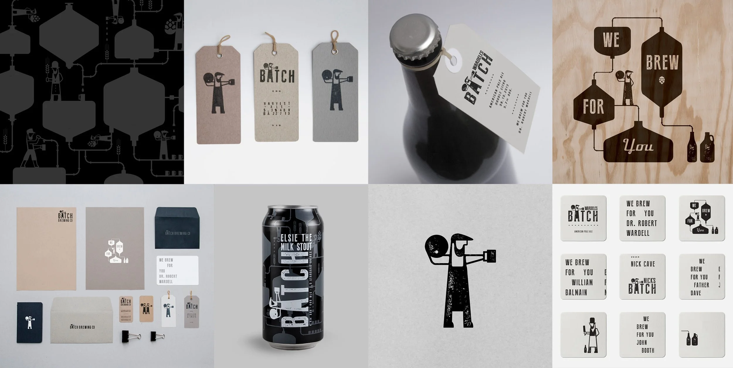
batch brewing company - we brew for you
BRANd STRATEGY • BRAND NARRATIVE • IDENTITY DESIGN • PACKAGING DESIGN • VENUE INTERIOR & SIGNAGE DESIGN
We’ve been involved with Batch since the day Andy & Chris decided to do the very first steps of the hard yards. They had just signed the lease of a massive warehouse in Marrickville and the only thing set up inside was their old home kit brewery with one keg. Andy had a clear vision of what this brand was all about, the most social by design craft beer brewery serving the local community of Marrickville. This vision informed everything. With the emphasis on social & handcrafted, we designed the first bottles with spray paint and stencils. We turned those bottles into brand communication by spraying messaging on the glass such as; We brew for you…Larry, We brew for you…Marrickville and We brew for you…father Dave. The brewer symbol became iconic and was essential in establishing Batch Brewing Company as part of the Sydney craft beer sub culture. From that moment on the Brewers at Batch kept their promise to the local community by experimenting with new flavours and new beers almost weekly. Andy’s knowledge of the American craft beer scene made him realise early that cans were the future in enjoying beer socially. He was one of the first to embrace this evolution and we created many many different can designs to express Batch’s flavour innovations.

RHUBI - NOUVELLE MISTELLE DE RHUBARBE
BRANd STRATEGY • BRAND NARRATIVE • NAMING • IDENTITY DESIGN • PACKAGING DESIGN • SOCIAL CONTENT DESIGN
This is yet again a brand creation and packaging project completely from scratch. The founders reached out to us to define a world around this typical French aperitif that got a touch out of fashion in the home country. Time to introduce this beautifully coloured rhubarb liquid to the Sydney bartenders, but now in a more contemporary fashion. When doing our research we discovered that Claude Monet’s famous mansion and garden is located right at the heart of the Mistelle region. His mansion happened to have the distinct green and deep pink rhubarb colours. The window shutters couldn’t be more iconically french so we decided to take this as the inspiration for the side panels of the bespoke bottle we had in mind. Because the founders wanted to inject female power and intuition into the brand we also crafted a stopper inspired by the ‘La Semeuse’ on the French coins. A female figure seeding new ideas, a symbol of progression and forward looking attitude. We added a tongue in cheek tone of voice to make it fun. A mix of mainly English and some French words we don’t really know the meaning of.